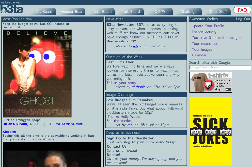
I have redesigned b3ta. I quite like the way it is now, so it's only a few functional changes and some design/theme changes. Firstly, to give you an idea of what I've done, here's the new-look homepage (all images are linked, as they're HUGE):
Clicky
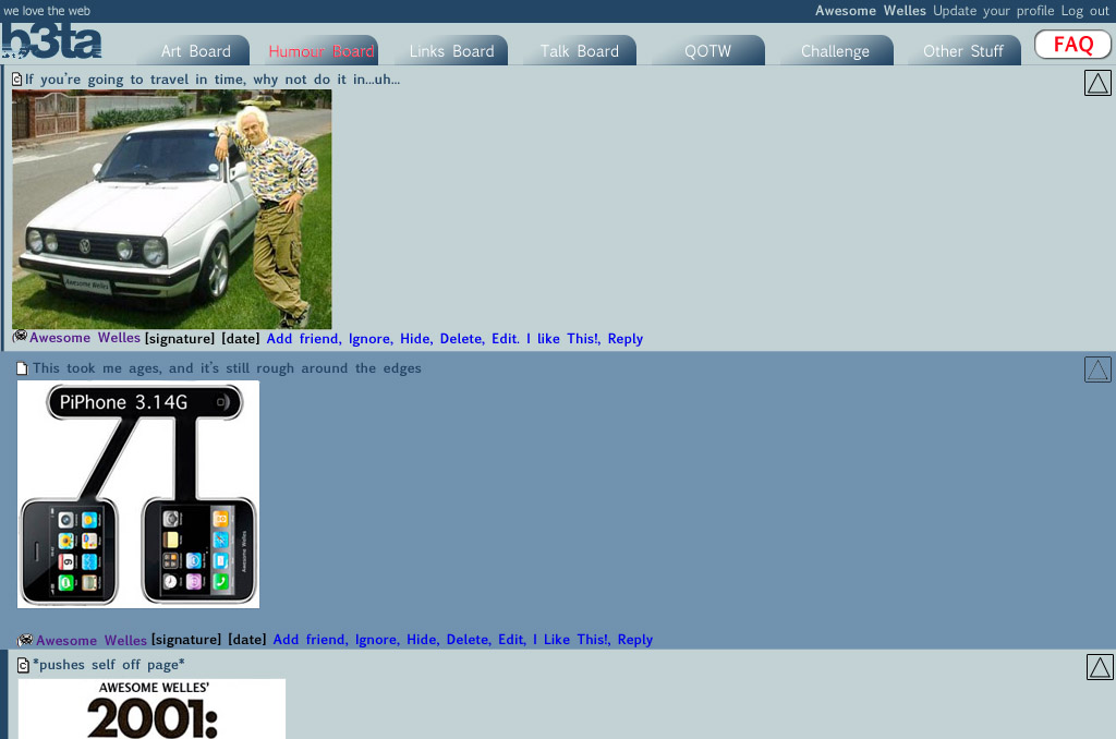
Then there's the way the new boards avoid all that scrolling:
Threads Closed You'd click on those triangles on the side to expand the thread. Then they'd look like this:
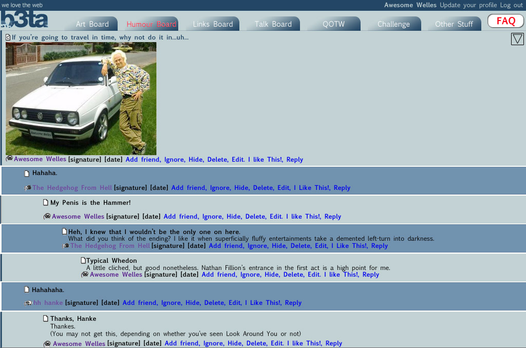
Thread Opened You would click on the triangle again to collapse the view back to how it looks above.
I've always fancied having a go at a redesign, and I quite like this. Please note I have nothing to do with the actual admin of b3ta, and I'm not suggesting it *should* be changed. It's just there's always been talk from a few posters about the current style of b3ta, and I thought I'd address some of the issues without going all Web 2.0 crazy. Really, this is just to get some idea of what most people would like b3ta to be, even though I am not in control of what goes on here. Please don't take this too seriously, and don't yell at me if you don't like it, as I'm actually quite depressed today, and I don't need it. Comment away.
(Clicky
Then there's the way the new boards avoid all that scrolling:
Threads Closed You'd click on those triangles on the side to expand the thread. Then they'd look like this:
Thread Opened You would click on the triangle again to collapse the view back to how it looks above.
I've always fancied having a go at a redesign, and I quite like this. Please note I have nothing to do with the actual admin of b3ta, and I'm not suggesting it *should* be changed. It's just there's always been talk from a few posters about the current style of b3ta, and I thought I'd address some of the issues without going all Web 2.0 crazy. Really, this is just to get some idea of what most people would like b3ta to be, even though I am not in control of what goes on here. Please don't take this too seriously, and don't yell at me if you don't like it, as I'm actually quite depressed today, and I don't need it. Comment away.
But to be honest, I'm mostly on a laptop with a trackpad thingumy, where scrolling is much easier than precision clicking
(But to honest, it ain't broke, don't fix it.
But very woo, none the less :)
(But very woo, none the less :)
thats a dandy idea and time well spent :D
(
My dog was put to sleep this morning. I have spent my time doing this just to occupy me.
(I'm not trying to be a cunt, and it's probably a lot better than I could do anyway
(I know you weren't, but I was explaining anyway. I don't know why. I might ignore yanmania, as he seems to be unable to provide any constructive criticism. I cannot abide useless people.
(great idea in theory
how well it works in reality I dunno man
also the colours is a bit blue innit
(how well it works in reality I dunno man
also the colours is a bit blue innit
It's just to throw some ideas out there. The colours are inconsequential, as you could probably just keep the grey scheme, or have some other colour. It was just nice to envisage the board with a brighter view.
(I'm sure you've seen epic javascript sites before
tho usually they are mired in several thousand shitty flash anims of course
(tho usually they are mired in several thousand shitty flash anims of course
I'm not a programmer at all, though I know some HTML, so it could be that this is completely impractical. But I wouldn't know, so I just added the bits I wanted. Like a real designer.
("TOO BROWN"
"I DON'T LIEK THE FONT"
:D
("I DON'T LIEK THE FONT"
:D
But surely the FAQ button should be increased by at least 500% to appease board Nazis?
The open and closed thread thing would be very good, I agree.
(The open and closed thread thing would be very good, I agree.
conversations in threads about halfway down the page, and whenever you reply to them, you have to scroll all the way down to find them again.
(thought everyones did that
(just as you are clicking reply
and it comes onto "I Like this" for someone trolling scat porn
ahaha, web browsers, minds of their own
(and it comes onto "I Like this" for someone trolling scat porn
ahaha, web browsers, minds of their own
like alt + ' to scroll down to the next new post. I don't think they work for everyone but i use them all the time
((I'm on a Mac using Firefox, btw)
(Try enable navkeys in your update profile page
(AHA! They work if you use Ctrl instead of Alt. Neat.
(Carry on, nothing to see here.
(It kind of seems a little big in itself too. Though I like the thought.

As you might be able to tell. Even though I'm a fan of the way it is.
(As you might be able to tell. Even though I'm a fan of the way it is.
I would like to see a touch-screen interface very similar to this on MY pc!
(these, with the right Linux package might do you well..
(...welcome our blue collapsible overlords.
'twould be nice if it was possibly added as an additional page style. Then I could choose between the existing and new.
I would hate to see it change anything for people who like things the way they are.
('twould be nice if it was possibly added as an additional page style. Then I could choose between the existing and new.
I would hate to see it change anything for people who like things the way they are.
Anyone have any quibbles about the showing of popular links on the homepage?
(but cr3 had something going that let you put additional styles on b3ta.
(I usually have more vague recollections than ideas.
I still miss b3tamonkey
(I still miss b3tamonkey
Or check out the Stylish add on for Firefox. You can adapt the style a little bit for each particular page. The B3ta one is OK, but stick your ideas in!
Suggest it as a compo!
(Suggest it as a compo!
Errrm, can't remember, but Stylish is a kind of collection of Greasemonkey elements so yeah, I'd guess so.
(No too sure about the blue. I'm kind of used to B3ta in the neutral grey.
I like the show/hide replys thing. Although personally I would have the arrow that you click in the place of the paper icon of the current posts. You could have it go red when there are new replys that you haven't seen that are hidden. This would also work nicely on the QOTW where you would be able to see the repys without opening a new tab or window.
The extra boards are an interesing idea. It probably wouldn't stop people shouting at others for posting the wrong kind of stuff on the board though... Still, I like it.
(,
Sun 20 Jul 2008, 16:46,
archived)
I like the show/hide replys thing. Although personally I would have the arrow that you click in the place of the paper icon of the current posts. You could have it go red when there are new replys that you haven't seen that are hidden. This would also work nicely on the QOTW where you would be able to see the repys without opening a new tab or window.
The extra boards are an interesing idea. It probably wouldn't stop people shouting at others for posting the wrong kind of stuff on the board though... Still, I like it.
So Mofaha, Killer Kitti, Tsattssr, Walrus Man, etc. who all post arty things most of the time can have their own area, and likewise for those that post humorous images. Not because I want segregation, but so that when someone posts some nice art thing on a Weds evening, it doesn't disappear in seconds. This way, the board's talents are still catered for, and everything has a better chance of being seen. It works with the open/close threads too, as conversations are not so limited by time as they are now. People tend to stop posting in a thread after 4 new ones are created.
(I like some of the humorous and some of the arty stuff, and I'm far too lazy to patrol 2 boards.
(as this is just for ideas/opinions, I put it in.
(It's nice to have pictures (and chat) on one board,
chat on another board,
links (and chat) on another
And another for stories (..and more chat)
(chat on another board,
links (and chat) on another
And another for stories (..and more chat)
but nice work anyhoo
There's a lot of people who like the current design, but quite a few others who aren't so keen. I'm sure there'd be a way to cater for both tastes.
And ta. :)
(And ta. :)
I think there are 4 or 5 different styles
(I'd quite like some news from the the mods here on what sort of stuff they're working on with b3ta, even if it's nothing. There's a suggestions board, but there's no indication of anything being acted upon.
(With the opened/closed threads.. I see a mixed blessing.
Some of my favourite pictures are those which the authors have deemed "not worth its own thread", and I might lose some of those.
But, of course, there are good points to it, too, such as the decrease in required scrolling.
At work, I find the grey useful because, to the untrained eye, it looks pretty mundane and a little work-ish. Bright blue seems to shout out "LOOK AT ME, FOR I AM NOT WORK RELATED!", and bosses might notice that.
(Some of my favourite pictures are those which the authors have deemed "not worth its own thread", and I might lose some of those.
But, of course, there are good points to it, too, such as the decrease in required scrolling.
At work, I find the grey useful because, to the untrained eye, it looks pretty mundane and a little work-ish. Bright blue seems to shout out "LOOK AT ME, FOR I AM NOT WORK RELATED!", and bosses might notice that.
but I myself love the simplistic outer design of this board, I wouldn't be a fan of it changing. But I love the style you have come up with.
So sorry that this morning was the morning. Were you there in the end? My cat died a few years back and I still miss him. But I am glad I was with him the last few hours....
(So sorry that this morning was the morning. Were you there in the end? My cat died a few years back and I still miss him. But I am glad I was with him the last few hours....
I'm still kind of shocked, and ploughing through waves of sudden emotion. Thanks for your concern, and I'm sorry for your loss, too. It's never easy.
(And The tab buttons up top look horrible!
How about a compo to design a new look for b3ta?
(How about a compo to design a new look for b3ta?
It's not a major point!
I had a thought that people could design a new theme for b3ta through a compo: everyone designs a new button for one of the bits on the board, and then for one week, b3ta looks like a ramshackle collection of misfitting delirium.
(I had a thought that people could design a new theme for b3ta through a compo: everyone designs a new button for one of the bits on the board, and then for one week, b3ta looks like a ramshackle collection of misfitting delirium.
and I quite like your b3ta redesign. I think it might be an improvement, actually.
(That's one vote for, versus about 13 against. ;)
(and have thought for a long time that it should be updated.
However, a lot of folks are very attached to the current look, so I don't expect much acceptance of any sort of change.
(However, a lot of folks are very attached to the current look, so I don't expect much acceptance of any sort of change.
But that is a little demanding, and I wouldn't expect it to happen any time soon.
(The colours need to be MUCH more subtle. The blue/dark blue replies need to be similar colours as those stripes just hurt the eyes. Imagine scrolling down that page! The tabs, should you insist on them (I don't like the idea, personally) should be close together and use something other than a cheap gradient. Furthermore I do NOT like the idea of open and closed threads. It'll just isolate people who aren't in a certain 'friends group'. What about humourous image replies also? Yeah, the main picture may not take your fancy, but what fantastic japery may be hidden in the thread? What the SHITTING FUCK is 'art' and 'humour' boards. No. Just... No.
(