From the Add One Word to Film Titles challenge. See all 1486 entries (closed)
(, Sun 24 Oct 2004, 12:30, archived)
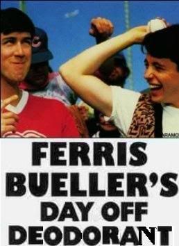
but ultimately the N was just too much.
(,
Sun 24 Oct 2004, 12:39,
archived)
It'll haunt me for a while..
I can usually make my own letters pretty well using bits of other ones (the T used to be an L..) Bu N reall sucks ass with these fonts
(,
Sun 24 Oct 2004, 12:40,
archived)
I can usually make my own letters pretty well using bits of other ones (the T used to be an L..) Bu N reall sucks ass with these fonts
it's always hard when you're making a letter totally unlike any provided. But pootling is strangely satisfying, and often ends up looking better than using a different font.
(,
Sun 24 Oct 2004, 12:41,
archived)
use the right slope of the A for the N!
/currently doing the same thing....
(/currently doing the same thing....
abuse of the top of the y could result in something useable though. You'd probably have to fiddle with it a while to get the look right.
(,
Sun 24 Oct 2004, 12:44,
archived)
is that if you can't find the right font, choose one that's vaguely similar (and squeeze/resize as needed) and then re-write the whole thing and it'll look far better
(the Notting Hill Gate one below is a good example)
(,
Sun 24 Oct 2004, 12:46,
archived)
(the Notting Hill Gate one below is a good example)
But on complicated backgrounds where you don't want to remove the original text, you sometimes have no choice.
(,
Sun 24 Oct 2004, 12:48,
archived)
they will display a png file of any letter of the found font, so you can nick the few you need without having to buy the font
(