Home » Image Challenge » Corporate Rebranding [Suggest a different challenge]
 Corporate Rebranding (This challenge is now closed)
Corporations spend stupid amounts of money to have designers tell them their logo should be a different shade of green. Show them how it should be done by rebranding existing corporations with names and logos that better reflect them, then post your results on the messageboard.
(Fri 11 Jun 2004, 10:12)
 1st post - be gentle
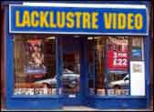
Probably been done but....

( elusive I'm not really here. You're imagining me, Tue 15 Jun 2004, 14:23, More)
Two in one day
elusive I'm not really here. You're imagining me, Tue 15 Jun 2004, 14:23, More)
Two in one day

It's my first go at a contest entry too, woo yay yarr. Wouldn't surprise me if it's been done already.
no it's not strictly accurate but it's been bouncing about in my head since the apple pie thing sorry chaps
(, Tue 15 Jun 2004, 14:01, More)
First post, so is probably a redex / too big / not funny / been done to death...

( C, Tue 15 Jun 2004, 13:51, More)
a rebrand was ordered
C, Tue 15 Jun 2004, 13:51, More)
a rebrand was ordered
to help promote their new range of natural-fibre enviro-cars.

(, Tue 15 Jun 2004, 13:41, More)
You wait for ages to be able to post, then are totally uninspired when you finally CAN

( Lempraadon, Tue 15 Jun 2004, 13:31, More)
they don't make buses so...
Lempraadon, Tue 15 Jun 2004, 13:31, More)
they don't make buses so...

scraping the barrel a bit, so soz
( custard, Tue 15 Jun 2004, 13:22, More)
Hmm, not sure
custard, Tue 15 Jun 2004, 13:22, More)
Hmm, not sure

if this even qualifies - just realised it's not corporate rebranding per se. Still, not t'only one, eh.
(, Tue 15 Jun 2004, 13:17, More)
300th post

Yes, sadly it's a RP but I changed it to an optimized JPG and had to re-link it.
(, Tue 15 Jun 2004, 13:12, More)
scally / chav / townie ubiqui-wear...

Something simple and minimalist for my first ever b3ta messageboard post. Hello everyone.
( Mike Fishcake teamfishcake.co.uk - better than your mum's face, Tue 15 Jun 2004, 13:04, More)
My third ever post on this board.
Mike Fishcake teamfishcake.co.uk - better than your mum's face, Tue 15 Jun 2004, 13:04, More)
My third ever post on this board.

And my third competition entry. Enjoy.
(, Tue 15 Jun 2004, 12:58, More)
bringing you a fresh slice of family in 30 minutes.

(sorry)
( thegoose, quietly backs out of the room hoping no one noticed, Tue 15 Jun 2004, 12:49, More)
....on platform one the one o one one service......
thegoose, quietly backs out of the room hoping no one noticed, Tue 15 Jun 2004, 12:49, More)
....on platform one the one o one one service......
Yes, it's complicated stuff isn't it? This country.
(, Tue 15 Jun 2004, 12:12, More)
One for the Festival Goers ...
There was a surprise late addition to the Glastonbury line up ...
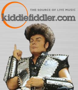
I preferred the old Mean Fiddler logo, but this is easier to 'Shop
(, Tue 15 Jun 2004, 11:47, More)
Corporate Rebranding
This is the aaaaaaaage.....

....of the very hot, very slow train.
(, Tue 15 Jun 2004, 11:47, More)
Corporations spend stupid amounts of money to have designers tell them their logo should be a different shade of green. Show them how it should be done by rebranding existing corporations with names and logos that better reflect them, then post your results on the messageboard.
(Fri 11 Jun 2004, 10:12)
Pages: 40, 39, 38, 37, 36, 35, 34, 33, 32, 31, 30, 29, 28, 27, 26, 25, 24, 23, 22, 21, 20, 19, 18, 17, 16, 15, 14, 13, 12, 11, 10, 9, 8, 7, 6, 5, 4, 3, 2, 1 (or see the popular posts)
Probably been done but....
(

It's my first go at a contest entry too, woo yay yarr. Wouldn't surprise me if it's been done already.
no it's not strictly accurate but it's been bouncing about in my head since the apple pie thing sorry chaps
(, Tue 15 Jun 2004, 14:01, More)
(
to help promote their new range of natural-fibre enviro-cars.
(, Tue 15 Jun 2004, 13:41, More)
(
scraping the barrel a bit, so soz
(
if this even qualifies - just realised it's not corporate rebranding per se. Still, not t'only one, eh.
(, Tue 15 Jun 2004, 13:17, More)
Yes, sadly it's a RP but I changed it to an optimized JPG and had to re-link it.
(, Tue 15 Jun 2004, 13:12, More)

Something simple and minimalist for my first ever b3ta messageboard post. Hello everyone.
(
And my third competition entry. Enjoy.
(, Tue 15 Jun 2004, 12:58, More)

(sorry)
(


Yes, it's complicated stuff isn't it? This country.
(, Tue 15 Jun 2004, 12:12, More)
There was a surprise late addition to the Glastonbury line up ...
I preferred the old Mean Fiddler logo, but this is easier to 'Shop
(, Tue 15 Jun 2004, 11:47, More)
This is the aaaaaaaage.....
....of the very hot, very slow train.
(, Tue 15 Jun 2004, 11:47, More)